Thursday, 1 October 2020

Something More Brief (3) Development

 Working on ideas after discussing as a group. The heat tech can be confusing so researching this is important before going forward. 

THERMOCHROMIC TECH:

Thermochromic Ink reacts to changes in temperature by exhibiting a colour change. These inks are available with a colour change activation at temperatures from -10°C up to +70°C. They are reversible, changing either way as the ink warms or cools.

These temperature reactive inks, also known as leuco dye inks, are a darker colour when colder than their temperature activation point, and lighter in colour or virtually clear when warmer than their activation point.

Available colours: Black, Red, Blue, Green, Orange and Magenta

Temperatures: Between -10 and 70°C.

DRINKING TEMP

Hot beverages such as tea, hot chocolate, and coffee are frequently served at temperatures between 160 degrees F (71.1 degrees C) and 185 degrees F (85 degrees C).

An optimal drinking temperature of approximately 136 degrees F (57.8 degrees C).

-------------------------------------------------------------------------------


^ Thinking of having the thermochromic stickers transition through various colours, showing the steam waves reducing as the temp goes down. 
- The issue here is that as the ink/sticker get hot it goes clear, not the reverse. 

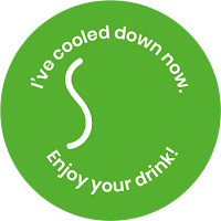
Lanie's logo development was really good, it showed a clear icon to represent the issue that was consistent throughout: 


I developed off of this logo, thinking about the text, what itll say, how that impacts the audience, wanting to keep a friendly tone. 


Felt the vibe of the text was good, however it was a lot to put on one sticker. 
Also there were issues here with the thermochromic ink/stickers here, unsure it is is achieveable or would you see all the text all the time, as personalised thermochromic stickers don'e seem to be available.

FOUND YOU CAN GET THERMOCHROMIC INK TO BE SCREEN PRINTED, SO STICKERS COULD BE SCREEN PRINTED, WITH THIS THE DESIGN NEEDS TO BE SIMPLIFIED. 

----------------------------------------------------------------------------------

Wanting to make the change of colour be the focus rather than the words. The colour could be an easy way to get the audience to understand the concept even without text. 


^ Thinking about the colour being an indicator of temperature as well as text. 
- This makes the thermochromic ink more useable for the idea.

We had another group talk and decided the colours and type could do with some alteration to elevate it further.


Above are the chosen colours. 
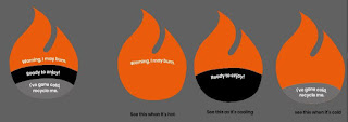
Below show the development of type and how the different layers would become visible as the drink cooled down .


Animated the logo to demonstrate how it would look on a coffee cup:


---------------------------------------------------------------------------

Thinking of potential applications for this to go further, to represent issue of packaging waste. 

The final image could be about recycling and encouraging the user to recycle the packaging the sticker was sent on. 
'We like out coffee hot, but our planet not.'
  -thinking of having a message like this to communicate an issue of climate change, especially as the tech we're using is all related to heat. 

This is something we could develop further if we were to continue the project, as we feel it has the potential to communicate a dual message. 


Tuesday, 29 September 2020

Something More Brief (2) Initial Ideas, Group Call

Sketching for initial ideas, wanting to keep things playful and fun. 
Finding inspiration for shape and colour palette from hazard symbols. 


Find the faces to have the fun, playful aesthetic, however, when the "transition" happens as the drink cools down it becomes more difficult to understand the message of the logo. 

The steam waves are more clear at showing this, but they have less sense of personality.

-----------------------------------------------------

VIDEO CALL w/ GROUP


Call with group to discuss ideas. 

We had a similar approach to the topic, Lanie had been experimenting with the idea of flames. Charlie has done some more abstract thinking about heat, heat transfer as well as how heat affects animals. 

We decided to experiment more with flames and steam as the visuals as these were what communicated most clearly.
Charlie suggested trying to link the logo to global warming, like how the cups are heat sensitive they could leave a message about global warming. 
- Thinking the image revealed could be about the effects of climate change, but coffee cups and takeaway food is contributing to the problem, could use the stickers as a way of raising awareness?

Lanie shared some research:
Wolff Olin (Oi Branding) - https://www.dezeen.com/2016/04/15/wolff-olins-logo-telecoms-company-oi-morphs-in-response-to-sounds/#:~:text=British%2DAmerican%20branding%20firm%20Wolff,to%20people's%20voices%20(%2B%20movie).&text=Quiet%2C%20low%20voices%20create%20%22calm,more%20wild%20and%20fluorescent%20symbol%22.


The logo was responsive to sound, it changed shape and colour when there was noise around.
- Really like the colours however, as discussed with Zoe we could use liquid crystal to develop a colourful logo, but the colour scale of liquid crystal is pretty counter intuitive and would be difficult to follow. 
- The simplicity of it is what's good, allows the brand to be recognised even when it's changing. 

Design Anonymous - https://bpando.org/2013/06/28/logo-designers-anonymous/?fbclid=IwAR3LlYCtfwVLXCfNCSffM9utEN6xcN3kms4QwTjNURpJcY9H8IZiFyK6_ZI


Branding incorporated the heat sensitive element, when it gets to a specific temp it goes transparent. 
- Again the simplicity of it makes it effective, with a complex technology you don't want the design to make things too complicated. 
- I have some thermochromic stickers that can be used to test something similar to this. Would be able to see the implications. 

----------------------------------------------------------------------

DEVELOPMENT:


The idea above shows the steam idea could be combined with text so when the drink drops in temperature more information is shown. 
- The steam is a good indicator as all stages of temperature reduction are visible as the amount of steam waves change. Whereas with the faces the in-between stages were more difficult to understand. 

What to do next?
> Think about practical applications
     - Maybe test ideas on sticker stuff I have
> Develop logo further, think is it effective? What am I wanting to communicate, does it achieve this? 

Monday, 28 September 2020

Something More Brief (1)

Something More - team of 5 people, studio of designers. Working in brand identity. Design shouldn't exist for the sake of it.

Design can:

  • Raise awareness of problem
  • help you care about it
  • Make you do something about it

Responsive graphic design to provide information:

  • Doomsday clock
  • Covid graphics around R number

----------------------------------------------------------------------

LOGO SIREN - BRIEF

Design a symbol that changes with the urgency of the issue it highlights. Raise awareness, create empathy, empower action.

  1. What is your cause?

Microplastics Screen time Food waste etc.

Then create a logo. (aim to communicate on its own terms)

Think of the presentation as a launch for the logo.

  • Where does it live? (where do people see it, newspaper, screens, etc)

Submit as a PDF/mp4 by Thursday 3:30pm (feedback on monday)

-----------------------------------------------------------

INITIAL IDEAS:
Thinking of working on a topic that isn't a huge one, more everyday that we experience.

  • Washing machine water tank
  • Hot drinks

Hot drinks could be a good one to go with, has a level of temperature as well as being a common issue in UK. Trying to avoid people burning their tongues on coffee as it's too hot.

Would be able to include heat sensitive tech. People could experience it in physical format, the application of the logo could be really interesting.

RESEARCH:
THERMOCHROMISM - The changing of colour due to temperature. Can get heat sensitive stickers that change colour with different temperatures. - This could be used in the project to enhance the "changing" aspect of the project.

--------------------------------------------------------------

As a visual thinking it should be fun and approachable as the application will be on coffee cups or mugs in home. The topic isn't too serious but should still be clear as to what it is communicating.

  • Needs to be able to communicate on it's own. What are we wanting to convey?

Heat, hot, warning Cool, fine, okay to drink. Could be one symbol developing into another? Would this be too confusing? Would the colour change be enough? Would people even remember what the colours mean if they go in a confusing order? 

Thursday, 21 May 2020

Module Evaluation 505

This module worked out a lot differently than anyone expected, many struggles came with having to work during lockdown. For me these involved not being able to visit galleries to gather more research as well as not being able to have peers use my designs to see the effects they had. However, I found that working alone has mean I've had to trust my own design choices more than ever which I think has been a key milestone during my study. As we haven't been able to get feedback form peers as readily as we normally would I've found comfort in my own choices and decisions.


Lockdown also proposed a lot of challenges with time management, as a lot of different and scary events have happened during this module my focus wasn't always on the module. I think this led me to take a lot of time to find my feet within the project, however, once I had developed a routine at home and found a rhythm with my work I feel I managed my time the best I could given the circumstances. Some days were harder than others, meaning the design rhythm was disrupted, however, the project I have at the end is one that I have enjoyed making and learnt a lot from. 


During this module the work I've made has been something I have found to be an area I'm interested in, physical and interactive design, I particularly loved working on developing publications. Having to work from home and not having the facilities we normally do at uni was a daunting prospect initially, however, it did take a lot of pressure off and allowed me to make things and test more freely without fear of judgement from staff and peers. I've realised during this module that I have been worried about the outcome of my work from the beginning and I haven't trusted the process of making mistakes and moving forward. Personally I believe this module, due to the circumstances, has taught me to be less precious about my work and put less pressure on the outcomes.


Sketchbook Pages

Monday, 18 May 2020

Final Outcomes

EXHIBITION:

Exhibition Pamphlet: https://issuu.com/eviecrook123/docs/sticker_publication_final


Printed in use:


  • Provides exhibition directions, as well as sticker prompts.
  • Incorporated aesthetic/branding.
  • Has the folding technique incorporated into index. 

---------------------------------------------------------------------------------------

Poster:


  • Has the folded text type, same as ticket for continuity.
  • Incorporates branding aesthetic.
  • Links well to the visuals on the webpage. 

-----------------------------------------------------------------------


Tickets:


  • Same visuals as poster once connected.
  • Has the fold intervention to tie in with publications. 
---------------------------------------------------------------------------------------

Labels:


Exhibition Layout:


  • The inclusion of the stickers and prompts allows the audience to become the artist, very similar to what Olafur Eliasson aims to do, as well as many artists during the Fluxus movement. 


---------------------------------------------------------------------------------

CATALOGUE:
Exhibition Catalogue: https://issuu.com/eviecrook123/docs/actual_final_working_file_for_scree_ea4f8118a560a8


Printed in use:


---------------------------------------------------------------------------------

SCREEN:

Mobile Website: https://youtu.be/xMw0e7sxOsc
Desktop Website:

Screen Refinement

> Previous design works really well with the clicking to remove the circles, it incorporates the audience well and presents an intervention the controls what the audience can and can't do.
> Doesn't really bring attention to the body as it's on desktop, however this is what the phone version is for.
 - This could adopt the walking feature with the phone to take advantage of a phone being a portable device.

Made alterations to video:


- Circles were made smaller so could cover the text while keeping it legible. This mean these circles could be added to the restricted element. The user can't move the cursor over these point. 
- Once the user had cleared all the circles possible they would appear again, making it like a game, but also gives the audience something to figure out. 
- I feel it embodies the exhibition in a simple way, forces the audience to behave in a particular way. 


Where to go with phone screen outcome: https://www.youtube.com/watch?v=8M-dGPXZxec
> Concept is good, feel as though it represents the exhibition experience well.
 - The pictures and text could do with being larger to make it easier to read and clearer to see what the image is.
 - The pop up prompt shouldn't disappear, I like the idea of having a collection of prompts on the website that the audience might stumble across as they continue to use it.
> The walking element should be added, it would bring the body in on a new level, takes advantage of mobile phones being a portable device.

LINK TO FINAL VIDEO RENDITION: CLICK HERE!

--------------------------------------------------------------------------------------------------

Crit with Zoe, Emily and Tom
We decided to have a final crit with our crit groups just to check in with everyone, make sure they're okay and tie up loose ends of projects.

Feedback:
> People suggested to incorporate the thermochromic stickers into the exhibition, these could be part of the interactivity and would allow people to place them over the work if they wish.
 - This could be a really interesting idea to include, would only be able to do it for the red and blue sticker as I haven't found anywhere that does any more colours than that.
 - Still want to incorporate all four colours as this allows for more prompts to be given.
> Suggestion for a prompt could be to place the sticker where you stood.
 - This is a really interesting idea but it clashes with the circles on the floor.
 - Could be place on the floor at the first piece of work you looked at?
> From this Zoe suggested the circles on the website could fade away rather than instantly disappear, representing the thermochromic stickers.
 - I like this idea, if I include the thermochromic stickers this alteration will be made to the screen versions.


  • Do I include thermochromic stickers? 
  • Would it become one element too many?
  • What would it do for the exhibition? 

 - Maybe instead of the audience placing the red sticker red stickers could already be placed over text in the exhibition, such as labels for the work, then the prompt would be to place your hand over the labels to reveal the work.
 - This would link well to the website too.
 - Or could the prompt be to place the red stickers over any text they see in the exhibition, and then to place their hands over them to be able to read what it says?

^ These ideas would add another element of interactivity to the exhibition, and make the audience aware of their body, hands and heat.

Alterations to make:
> Cover of publication to avoid becoming repetitive.
 - Exhibition pamphlet cover, ticket and poster be the same (same with web as they're all related).
 - Exhibition catalogue be different on the cover same style but made to suit the publication more (lower down one). 
> Exhibition incorporate a thermochromic sticker, this is to be placed over text.