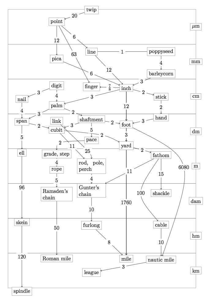
^Found this conversion chart depicting the system in it's units.
- It demonstrates how random the scaling is, as well as how many different units there are.
- It puts it into comparison with the decimal system, allowing people to understand it further.

^ Altered the type to suit the publication (would be printed in white on black). The numbers again being in black letter, and the words in the same typeface as the 'in context' pages.

^ Here adding in the illustrations into the gaps, thinking about incorporating imagery.
- Is this necessary? It seems to just be confusing the page more, distracting from the diagram.
- Maybe the gestural strokes could be used for the arrows?

^ Tried with the more gestural strokes, wanting to have a visual link to the illustrations.
- Think it is too busy, too many different aesthetic competing with each other.
- Can't tell which direction the conversion goes in, quite an issue.
 |
| before |
 |
| after |
Having the boxes removed around the words:
- allows the arrows to have more space.
- don't feel as though there's as much a clear division between the conversions and the units, they look like they're the same even though they have different typefaces.

- Thinking of having the boxes be manipulated in some way.
- Not sure it relates to the rest of the publication, it a quite different aesthetic. It also doesn't play on any of the themes the other design choices do, not to do with scale really, or the history.
It's much better in comparison to earlier attempts:

Thinking with the cover of having more of a modular looking cover, wanting to match the aesthetic of the typographic posters.
- varying width
- varying weight etc.
 |
| 1 |
 |
| 2 |
 |
| 3 |
 |
| 4 |
 |
| 5 |
 |
| 6 |
 |
| 7 |
(1) original test with the varying scales, think it works, but might look odd on a portrait cover, especially if placed landscape. Definitely has room to be developed further.
(2) Beginning to experiment with having the letters rotated, creating a new grid/format. Think having the E rotated makes it look too much like a modular M, maybe try with other letters.
(3) Having a shift in the type links back to the text, having breaks in the page. Again change the E rotation.
(4) More legible, with again a break in the text linking to the content pages. Could do with refiguring to suit a portrait layout more so.
(5) Difficult to read with the extended I, think it distracts from the text as it's so large, looks like a partition rather than a letter form.
(6) Not very successful, too block like. It's also difficult to read.
(7) Most successful, doesn't have the breaks but feel as though the spaces within letter forms creates a similar appearance.

Further experiments, looking into the arrangement of letter forms on the page, wanting it to fit when portrait - difficult as we read left to right it becomes less legible when the letters are arrange to fit landscape.
 |
| F1 |
 |
| F2 |
Two final potential covers (will be printed with white ink on black paper).
F1 fills the page completely, where as F2 has more of a modular feel and relates to the breaks in the body text more.
Response from peers shows that both are good options.
- F2 is easier to read (due to the horizontal arrangement)
- People responded well to the layout of both, but for different reasons.
I prefer F2 layout, it's more interesting and plays with the idea of scale more, it also incorporates breaks on the page.
Mock up
The front cover looked very flat compared to the inside pages, trying to rectify this.
Thinking of replacing the type with the texture's in Sophia's illustrations.

 |
| Felt as though this had too much pattern, it reminded a lot of people of camo print, which isn't ideal. Think this could be on the right track though, potentially have the illustration behind, and less busy? |
 |
| With the image behind it didn't look right, something about it was off. This style hasn't been used in the publication in any way so looks out of place on the cover. Need to test with a bigger overall pattern for text only. |
 |
| Close up of the illustration replaced with the type, think this is the best result. The image isn't super clear as to what it is which is good, only issue is you can see multiple layers, need to multiply them and repeat the process. |
 |
| With multiplied layers, colours are more intense, has a better overall impact. Need to print and compare on the mock up. |

Also in mock up need to test for creep and alter pages accordingly (move closer to the centre when there is more creep).
Reflection of the Cover:
Think the cover is too different, once printed and compared with the zine it didn't fit with the rest of the publication. Wasn't sure where to go. Looking through pages in the zine the 'in context' pages had a more unique arrangement of images that could incorprate more grit and texture onto the cover.
- Experiment with this.
 |
| 1 |
 |
| 2 |
 |
| 3 |
 |
| 4 |
 |
| 5 |
 |
| 6 |
 |
| 7 |
 |
| 8 |
 |
| 9 |
1&2 looking at having an illustration of a barley corn on the cover. However, this feels rather different still to the inside. Arrangement was off but didn't continue further as I felt it wasn't the strongest idea.
3-9 were looking more at the layout of the inside pages. These were more successful, they had a stronger relation to more elements of the zine. Some didn't have as much balance within the composition, such as 9 and 5. Others appeared too block like, such as 3,4,and 7.
6 is the final decision, it contains the most visual link to the publication as well as having a stronger composition.
Looking into elastic options:
1. Round elastic


Really like the appearance of this one, however, it has to be tied. There's no way to attach the ends together without this, it makes it super bulky and unattractive.
2. Flat Elastic:


This elastic is more successful, it lies flat on the page, and can be sewn together to there is no ugly looking edge.
No comments:
Post a Comment