> Incorporates the folding mechanism to encourage the audience to interact with the publication, breaking the way we traditionally use a publication to bring attention to the body through control.
-This method achieved the aim of attention and control the best through my experimentation.
> Layout adopts the eye tracking points found in primary research.
- Employs a random placement with structure, having artist, piece title and date on these focus points really brings attention to central points on the page.
Wasn't sure how to arrange text, previous experiments had minimal text, I wanted the publication to be a way to provide more information about Fluxus and the different works in the exhibition, It is something that can be kept and looked back on for those who want to.
> Tested having the text placed simple on the page near to the photo.
- No restrictions of where text would go.
Full Book:
https://issuu.com/eviecrook123/docs/eye_tracking_fold_seen_text
When you folded the page the text from other works was visible, this made it confusing to navigate.
- Difficlut to tell what text related to what images or which titles.
> Needed to have a clear distinction between text so the audience wasn't left confused.
Full Book:
https://issuu.com/eviecrook123/docs/eye_tracking_fold_unseen_text
> Here the text is isolated so it doesn't take up more than half the page, this way when it's folded over the only text visible relates to the picture formed.
- This is much more successful, should employ this with final publication.
What to do:
- Need to add in other works that will be displayed in exhibition and finalise text used.
- The text in mock-ups was a little too large, made it more difficult to read through.
- Decide on the physical side of the publication, paper type, size etc.
What size should it be?
> The bigger the more the user has to use their body to interact with it.
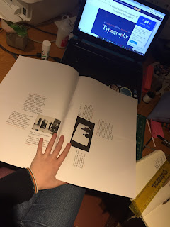
- Tests made at home are A5, these still require a lot of interaction. Tested with being larger (A3 and A4) and the effect was just more faff, it was harder to move the pages. Feel as though this would deter people from using the publication. Needs to be manageable.


^ A3 experiment.
The publication is currently 24 pages long (with additional works inside), it isn't too thick so having a larger scale publication would only emphasise this.
Feel as though A5 is too small, want the photos to be larger and there be enough room still for text.
A slightly wider publication would prevent the text columns from being too thin, allowing more text per line, making it easier to read.
> B5? Proportions are the same as A5, need to look at own books to find size.
230x170 < found this and it is a wider book making the text able to fit nicer on the page.
Final Spread:
https://issuu.com/eviecrook123/docs/actual_final_working_file_for_screen
Production of Publication:
Size: 230 x 170 mm
Paperstock:
> Can't be too heavy otherwise folding will become difficult, no heavier than 120gsm
>Matt, gloss or satin?
- Matt would be best, could use same paperstock as creative report, olin regular 90gsm.
- Want to avoid seeing through the pages.
USE OLIN REG 120gsm.


No comments:
Post a Comment