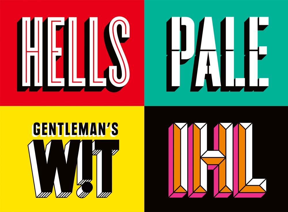
Camden Town brewery have a very recognisable style, spanning from their bottles, to cans, to tap headers etc.
The logo used Gotham black/bold I can't tell which, but this creates a really bold and powerful impact. The names of the brews are all rather stretched, but have different styles, this is a really nice way of having each brew be packages slightly differently but remain consistent.


- Try developing own rendition of the typeface but to go along with 'fresh'.
- Wanting the type to fit with the illustrations as well as look as though it fits with the existing type.
- Working on the letter R, I had to construct it as it didn't exist in the letter forms.
- Took the letter P and altered it according to the anatomy of the other letters (E and H).
^Final letterforms
- Wanting to experiment further, what ways could the letters be altered to show the theme of fresh?
- Test arrangement as well as additions.


- Inspired by the WIT type tested reversing the letters to see the impact it would have.
- The results were underwhelming, they didn't add anything to the type, and didn't communicate anything surrounding the theme fresh.
- More varied designs for the type.
- Wanting to incorporate a more hand drawn element to the type, wanting it to work with the illustrations rather than against.
- The digital hand drawn elements work, but need to test with the illustrations and it feels they could be limited.
^ Looking at how it would work, it fits, however still appears as though it's misplaced.
- Furthers the flat feeling of the digital illustrations.
Kat's Collage of the Print:
- Need to rethink the text as with this collage it'll probably look really odd. (TEST THIS)

^The text isn't too bad on these, however there is a sense of disconnect between the type and the illustrations.
Need to consider:
- The materials (chinagraph, paper etc.)
- Need to think about the way the letters interact with the characters, with this composition there is a stark difference between the illustrations and the type.


Here i separated the shapes from the collage and overlaid them before cutting out the letter forms from this and placing onto the poster.
- This really reminded me of a make-up campaign, they looks like swatches of red lipstick or eyeshadow, mainly because they're different shapes of red.
- Needs to have more context added to prevent this from happening.
Within the illustration there are potential letter forms, however not enough or as recognisable as a traditional typeface. The letter forms developed need to legible as they will be used on advertising materials.
Kumail Animations:
Sent Kumail these stills that were early ideas to see whether these could be animated into a dance:


The result:
The result was really positive, it could be used within the promotional materials, such as adds or on the website.
Going back to type:
Taking the stills used for the animations and thinking about how this could be transitioned into type.
- Try to convey the same sense of movement as the animation
- Keep the same hand drawn style to the work
- Avoid having the letters looks like people but use a similar aesthetic.
- Scanned in and reversed, wanting to try and replicate a similar effect to the collage and chinagraph.
- When placed over the image the text fell flat, it looked like bad bubble writing.
- It's the shape of the text that isn't working very well, need to think of a way to solve this. Maybe try using Gotham (typeface used for Camden logo).
- The china graph tied the two together which worked well for the piece overall, but need to be careful when using it that it doesn't become overused.
- Experimenting with the use of the chinagraph pencil, in other ways.
- The lowercase letters may appear more soft with the illustrations.
- Outlines could be placed as a collage, trying to tie things together more.


- This typeface works better, it has a softer feel than the tall slim typeface in the first experiment.
The chinagraph works, but maybe need to see the text using the collage. So still the Gotham typeface, but hand cut out of the collage papers.


No comments:
Post a Comment