Containing a series of "event scores" that replace the physical work of art, with instructions that an individual may, or may not, wish to enact.
Scores in the publication (found from wikipedia):
CLOUD PIECE
PAINTING TO EXIST ONLY WHEN IT'S COPIED OR PHOTOGRAPHED
PAINTING TO BE CONSTRUCTED IN YOUR HEAD
SNOW PIECE
TUNAFISH SANDWICH PIECE
PAINTING TO BE STEPPED ON
The pieces are very lucid, they have a sense of direction but with the whimsical floaty feel, others are more to the point.
The scores have a rhythm despite being only words on a page - this could be something to think about with own project, manipulating the way we ready text to have a rhythm/beat/tone etc.
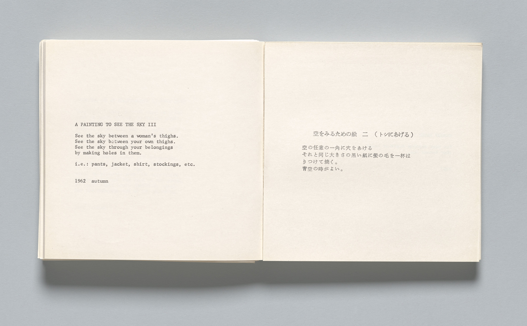
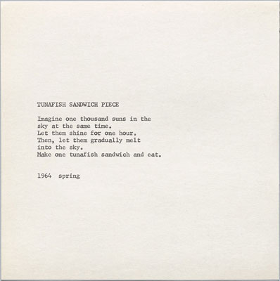
The presentation of the work is very simple, uses a typewriter for the text. From my research is seems there is no imagery only text. Having images could be distracting for the reader, a lot of the scores encourage the individual to image thins, having imagery on the page could infiltrate the readers thoughts.
Ryan Carl Studio
- ' A design practice rooted in radical simplicity'
Really like this description of his practice, I want my work to mimic this sentiment.


Word play series - the way the letters are used and manipulated to make the audience think of something so simple in a new way. The use of a physical change to represent a change in words I think is really interesting.
I has a very strong sense of concrete poetry, how this is laid out and the fact it directs the audience in some way. - Thinking this could be interesting to experiment within my project, playing with type layout, developing more interesting ways of reading/experiencing text could be really interesting.


Lots of Ryan Carl's work is in this style, sophisticated in appearance and playful in context.
Ryan Carl studied religion and philosophy — receiving a Master’s degree from University of Oxford — before becoming a self-taught designer and opening his own studio in 2005. He states 'My academic background has informed my process and mission of designing with thoughtfulness and purpose.' - This inclusion of academic reasoning behind his projects is really interesting. Having a different focus within study translates a lot through the work. How could I translate this and apply to my own practice?
No comments:
Post a Comment