- Wanting to have everything else be more questionable apart from the figure.
- Think by isolating the individual this would be achieved.
 |
| Blur |
 |
| Grain |
 |
| Glow |
 |
| Charcoal sketch |
 |
| Colour halftone |
- Out of these I think the most effective is the blur, it really prevents the audience from understanding what is happening elsewhere in the photo.
- Makes all your attention be placed on the figure as you can't make out the rest of the image.
I repeated this effect on the rest of the images I have:


It quickly becomes very repetitive, as there isn't much to focus on other than the individual it become boring to engage with.
What could be done to counteract this?
- Have text, maybe incorporate prompts that describe the actions of the person, this could feed into that notion of having the end product be a catalogue to give to people when going to a gallery. Prompts would need to be applicable to most galleries if this was the case.
Test 1


Experimenting with placing text as prompts over the image.
Finding it to be quite distracting from the image, like this idea but maybe having the text interact with the image so much isn't the direction to go in.
- Could be due to the type, it's very heavy, maybe have in a lighter weight?
- Try different arrangements and type varieties next
Test 2
 |
| Not very successful, quick test, not much consideration. Finding the fact some sentences are a lot shorter than others is becoming an issue. Makes it difficult to have a justified appearance without looking odd. |
 |
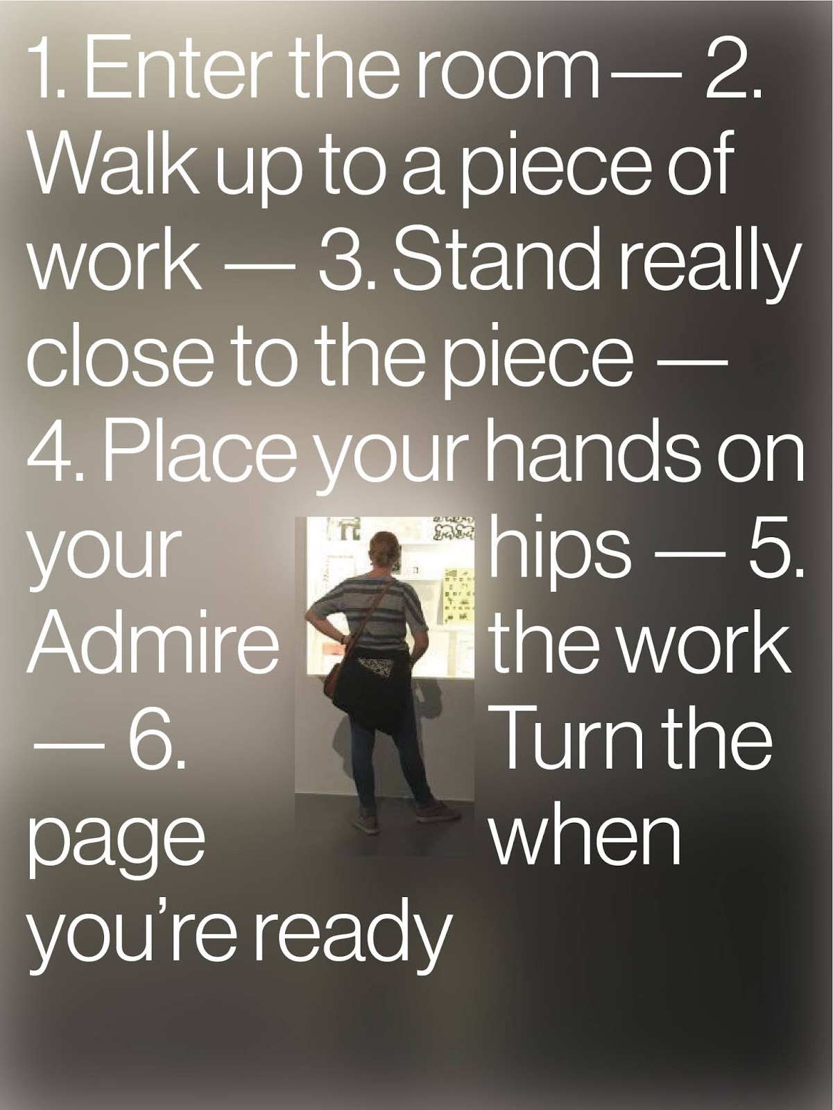
| Thinking of placing all the text in one continuous chain, separated by em dash to make a clear distinction between the different statement. Think this is more successful, not sure it is needed to be on the image though (this will depend on the product I decide to go with, screen or print). |
 |
| Having the text cover the majority of the image, I think this distracts from the image, especially in this situation since the figure in the photo is so small, it could be more effective in a different composition. |
 |
| The composition here is more effective and compliments the two items, the balance is there between text an image I think. The colours are also very minimal, makes the piece overall look more cohesive. |
- Want to make sure I'm avoiding the pages (if a publication) getting too repetitive, leading to a loss of interest. Have the composition of the page be dependent on it's content?
- Does it make sense to have this be presented on screen? I don't think as much, unless it was a virtual recreation of the exhibition but I don't think it is appropriate at this point in the project.


Testing this idea
- Very much in early stages, needs to be developed more, feel like there needs to be more consistency with it.
- Maybe select specific images? Some of the photos are really poor quality since being taken on a phone in low light. Could perhaps look at stock photos or photos on different gallery websites.
- Feel like the arrangement of text is good, the use of an em dash provides a more exhibition feel I think. This could work within publication idea potentially?
No comments:
Post a Comment