Site Gallery:


> Presents information about the event, a description about the artist and the exhibition itself.
> Displays one photo as a header, not any other content that will be in the exhibition.


> Displays information about the exhibition, the artist.
> Also displays some of the works, contains more imagery than Site Gallery.
Not sure whether the screen aspect of the project should be a website for the exhibition, or as a separate entity.
> The examples above are gallery websites that display the information about events being held at that gallery. So HOME Manchester would be where you find out information about the exhibition, not it's own website.
- Do I want to change this? Have own website for displaying information?
- Should the screen element be it's own thing, not relating to the exhibition?
-----------------------------------------------------------------------------
Aim: Present information to the audience in a way that brings attention to their body.
1. Exhibition - allows people to have a physical interaction with art in a traditional setting, interventions bringing attention to the way things may have changed.
- Physical intervention of having rules where people can and can't stand in the exhibition to bring attention to our movement.
- Have an interaction the public can do to make their mark on the exhibition, tracking individual experiences.
- Displaying works from Fluxus movement, this movement was a lot about audience participation and intervention within art.
2. Publication - People interact with books in a similar way, depending on different elements (paper stock, bind, hardback etc). Having interventions preventing the normal way of reading a book brings attention to the body.
- Having the scale be slightly harder to navigate, thinking about interaction with newspapers compared to small scale books.
- Audience has to interact with the pages in order to read the content.
- Content is the same as exhibition, providing a catalogue of the exhibition but also as a way to experience Fluxus work through a publication with a physical connection.
3. Screen - People interact with digital media is a similar way, eye tracking has shown people tend to look at the page in a T shape. How can this be altered to bring attention.
- Taking the traditional way of using a website and trying to alter it.
- Fewer physical interventions are available on this platform so eye tracking will be the key point of control, displaying information on the screen not where it is traditionally presented.
- Presenting Fluxus work again to mirror the interactive element of the website.
---------------------------------------------------------------------------
> Website working like one big sheet which you have to navigate around.
> Includes prompts to direct the audience.
- This might not be as cohesive with the other works, but if there was a opening page with directions and instructions for navigating the page (similar to what will be on the doors of the exhibition).
> This feels like an interesting idea to continue with.
- However, instead of having the website look like a traditional one the elements could be manipulated. E.g. title in the bottom corner, click the menu button and it opens at the top.
> Could have the circle idea developed recently of circles being all over the screen until you move your mouse to get rid of them.
- Could have layout similar to book with date, title, artist on some of the circles, and these not disappear once you swipe your mouse over them.
-----------------------------------------------------------------------------------------------
Development:
> Stills from website idea
- Would present details about the exhibition, but the work as well.
- Be presented in a way that incorporates the aesthetic from the exhibition and the book.
- Play with the circles similar to previous experiments.


Home page - The circles would highlight the different selections when hovered over.

Example of works on website.

When the user hovers their mouse over the title more information about the work appears.
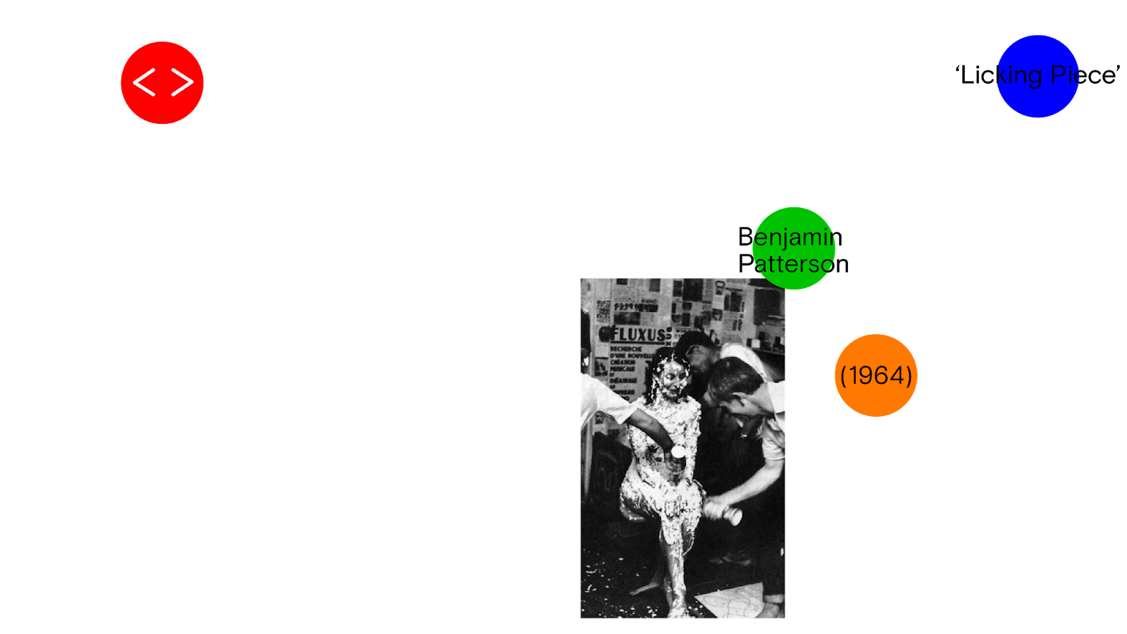


^ More examples of this.
> Animated with the addition of interactive circle element:
- When the audience moves their mouse over the page it gets rid of the circles in the way.
- The information presented on the website has no formal structure, it runs off the same theme as the publication where the information is presented on circles at the points people looked at a poster in previous primary research.
Reflections:
> Does the online need to provide masses of information about the works?
- Does this over complicate the idea?- Could it simply be the images and title works?
> Should the circles the audience can remove with their mouse be larger?
- Could show more of a difference?
No comments:
Post a Comment