The Gender Technik Museum Publication:
Simple alteration the the chapter heading and page number, they've be rotated 180.
- Small change that makes the audience question the form of the book, makes you realise something is different to the way it was before.
- Could the idea of rotating to navigate the book be put into place? Thinking about the work experimented with earlier in the project and how this changes the reading experience.
- This was done in a much more subtle way than I had experimented with, try developing something like this.
https://www.itsnicethat.com/articles/ok-rm-untitled-art-010216 OK-RM branding for Miami art fair:
> Has a very simple map for the works, thinking how could this be altered to suit the exhibition?
- Could make design decisions based of exhibition curation.
- Could make design decisions based of exhibition curation.
> The idea of having something in the exhibition that the audience could take away with them.
- How would this bring attention to the body, how would it work?
- Feel as though this idea could be isolated to prompt, could there be something individuals collect to add the the catalogue?
- Feel as though this idea could be isolated to prompt, could there be something individuals collect to add the the catalogue?
- Could this incorporate colours to highlight letters that join together to make a sentence? Feel as though having specific letters highlighted a colour could be an interesting way to bring colour into the design process.
Developments:
> Thought about the arrangement of the Gender Technik Museum Publication and how perhaps having more text, and a more formal book structure what this could do for the publication.
Developments:
> Thought about the arrangement of the Gender Technik Museum Publication and how perhaps having more text, and a more formal book structure what this could do for the publication.
> Having more in depth information about the works could be a way to present the exhibition.
> The sections about different works flip, meaning the audience had to turn the book around in order to read it.
- Really like this idea, feels a little obvious though.
- Feel as though there needs to be more structure to how it flips and when.
- Perhaps could combine this with the folding publication?
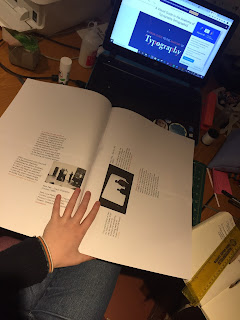
Playing with the idea of having a larger scale publication as the catalogue, wanting to get the body involved more.
- With a large format the audience will struggle to navigate the publication making them more aware of their body (reflecting on how individuals use newpapers).
> Experimented with having the images rotating, the audience has to rotate the publication in order to read it.
The images were placed on at random, they didn't have a reason for being where they were.
- Like the idea but it needs refining.
- Worth printing out and sticking sheets together to mock up the way it would work.
Thinking back to the primary research I did at university with the eye tracking, could place these images where people looked first second and third on a page:
> Much more chaotc text overlaps making it impossible to read.
> The purpose of the catalogue it to provide information, it feels as though it needs to be legible in one way or another.
> Perhaps having one image per page could make it easier to achieve this effect.
> Here having one image per page.
> Presents as much less chaotic, like the inclusion of the numbers
- try presenting more text where the numbers are, providing more information.
^ Here having more text on the page, placed in order of where people looked at the page.
> Feels like this is a good way to get the audience to have to navigate the page.
> Still feels a little too chaotic, need to potentially play and develop grid to make it look more clean, see how this works.
> What about the typeface? Used garamond as it's a more traditional form of type. Feel perhaps having a sans serif typeface might lift the aesthetic, making it more contemporary?
> Additions of colour (blue or red) could be interesting to start pulling in.
^ Removing the numbers and changing the typeface.
> Feels much neater, but needs a sense of direction.
^ Using lines to direct the audience, feels calmer but more obvious.
How do these relate to the audience?
What does it make them think when interacting with the pages?
- Don't think all are too successful at bringing attention to the body.
^Thinking about what Helena said about larger scale publication, newspaper size for example.
> This was interesting as an experiment, I'm not sure if it brings attention to your body more, it just made me think that it would be really difficult to navigate.
- Tested with A4 and again this didn't change much.
> It definitely makes you aware that the size is unconventional, causing you to do larger movements. But I feel this would discourage people to engage with the book.


No comments:
Post a Comment