> Content places on the page where people don't normally look.
- Where is this? Find out.
> Mouse tracking that obscures the view, bringing attention to the movement of the mouse.
- Either leaving a trail that needs to be removed
OR
- Using the mouse to remove objects that are in the way (experimented with this earlier in project).
Research:
Design Systems International: https://designsystems.international/
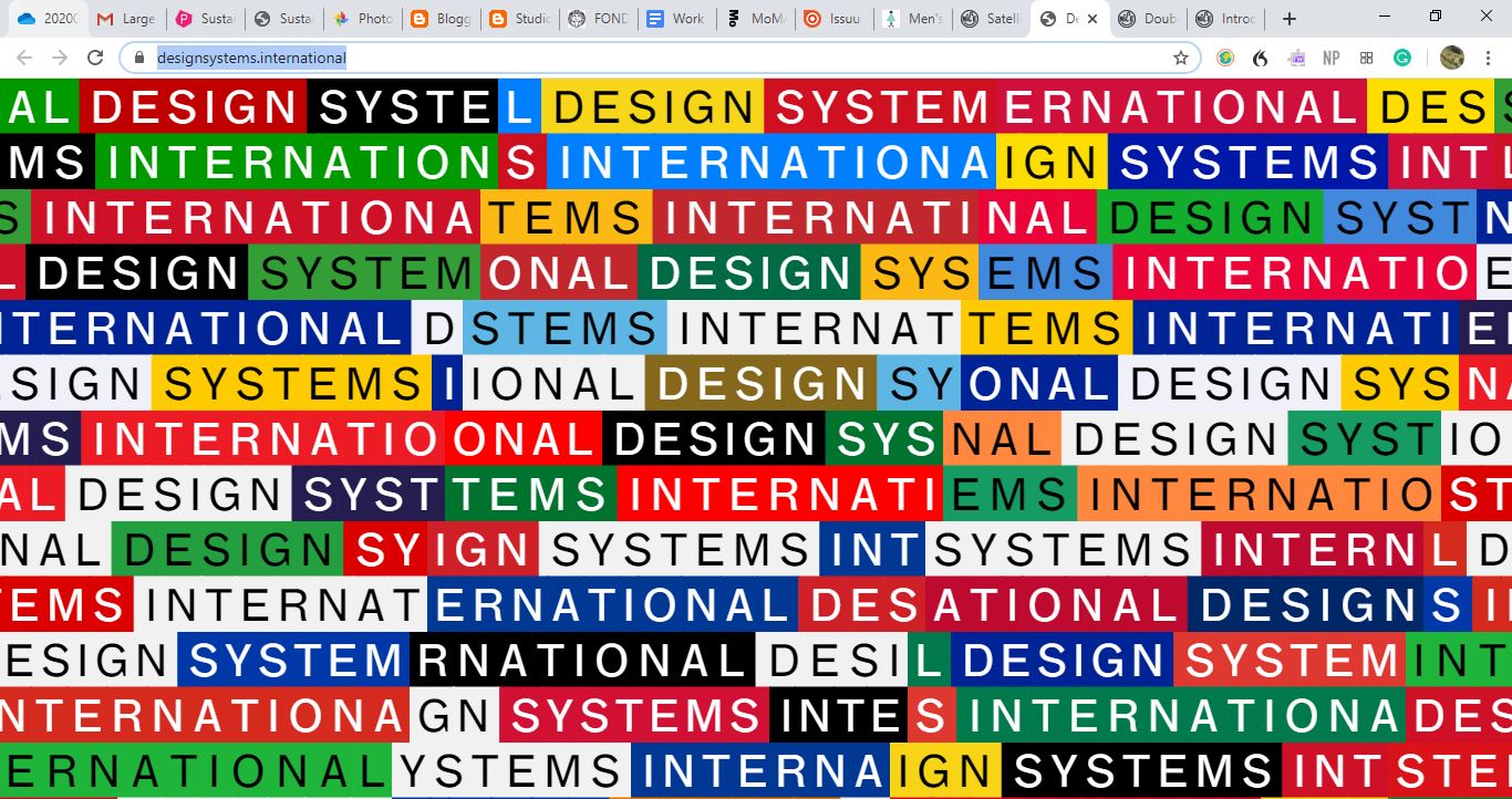
^ The first thing you see on the website it keeps moving and transitioning but all says 'Design Systems International'.

^ Once you click the page, the text 'please scroll down' appears on the page in the colours of the section you clicked.

^ When you scroll the text appears as the bar icon returns to saying 'Design Systems international' and the text appears to be moving out of it.
> The website controls what the audience can and can't do by having instructions and minimal movements/info available.
> The colours are crazy and overwhelming at the start, it hurts the eyes, but once you click things get more and more simple.
> Really interesting navigation, super simple but well executed.
- Makes the audience realise there is a massive difference between this website and others, this forced me to pay more attention to what it was telling me to do otherwise I wouldn't have known.
- You're forced as a member of the audience to forget everything you knew about websites.
-----------------------------------------------------------------------------------------------
Steven Thorne: https://museumatlarge.com/


> The audience clicks and moves to direct the audience.
> The website only displays 6 pieces of information and you can only move in one direction, once you reach the end it starts again but in a different colour.
- You really have to submit to what the website is wanting you to do, you have very little control apart from one simple action to do, the website does the rest.
- Really like how simple it is, has a landing page then displays the content a sentence at a time.
-----------------------------------------------------------------------------
p5 Experimentation:
> Thinking about what Helena suggested in an earlier crit.
Thinking about the way this could work on the page, would fit in well to the idea about having the mouse become an obstacle.
- The colours could match the stickers used in the exhibition.
- To get rid of the path the user would double click their mouse?
I think this idea would be really unique and interesting, it shows a aspect of using a website that is normally hidden, and creates an intervention on it's own.

^ Seeing what the idea might look like visually.
> Think it could be interesting to play around with.
- Perhaps instead of following in a long chain the circles could appear randomly when the mouse moves? This might develop an effect more consistent with the rest of the branding:
- Perhaps instead of following in a long chain the circles could appear randomly when the mouse moves? This might develop an effect more consistent with the rest of the branding:

> Feels more consistent, however doesn't show as much of a clear path that the mouse tracked.
Which is more effective?
- Need to see when the rest of the website is developed, this way can tell which is most appropriate.
There needs to be a way to get rid of the circles, otherwise the website becomes unusable for the audience.
Thinking back to research on Pentagram's Website:
> The website itself was really interesting to navigate.
> There is so much information, but it is presented in a clean, simple way making it easy to navigate.
> Really liked how not all the information was presented to you straight away.
- Key quotes and images were presented first, and then there were options to find out more information by clicking.
- Feel like this could be a really interesting way of approaching the website for the exhibition.
- More information the deeper you go?
> It is obvious the audience has been heavily considered in the design of the website, making things as easy as possible to navigate.


What does this mean for my Project?
> What should I include on the website?
- Information about the event only?
- Information about the event and about the works?
Website Displays:


> Presenting information, paragraphs could appear when the audience moves the mouse over it?
Seeing the effect of the mouse tracking, not sure if I think it works, the mouse tracking seems too random, would need to follow in a trail to be more successful (test this)
Mouse moving the circles out the way idea:
This feels more interactive than the other idea, the audience has a sense of control but is being forced to remove the circles to be able to navigate the website.
> Feels like this will have the most visual consistency with the exhibition, especially with the sticker intervention.
What to do next:
> Finalise Exhibition idea.
- What the intervention is (look back through fluxus prompts)
- What the layout is (on floor)
- How publication relates.
> Research exhibition websites
> Think about type again, going back to folded type idea.
- Where to apply this?
Which is more effective?
- Need to see when the rest of the website is developed, this way can tell which is most appropriate.
There needs to be a way to get rid of the circles, otherwise the website becomes unusable for the audience.
Thinking back to research on Pentagram's Website:
> The website itself was really interesting to navigate.
> There is so much information, but it is presented in a clean, simple way making it easy to navigate.
> Really liked how not all the information was presented to you straight away.
- Key quotes and images were presented first, and then there were options to find out more information by clicking.
- Feel like this could be a really interesting way of approaching the website for the exhibition.
- More information the deeper you go?
> It is obvious the audience has been heavily considered in the design of the website, making things as easy as possible to navigate.


What does this mean for my Project?
> What should I include on the website?
- Information about the event only?
- Information about the event and about the works?
Website Displays:
- Information about the Exhibition
- Location
- Opening Night
- Running Time
- Name - Information about Fluxus
- What is is
- Where it started
- Why it started
- Where it is now - Maybe examples of the works
Thinking about the arrangement of items on the screen.
Having the information being displayed in the corners, where people don't normally look as this isn't where content normally is displayed.
- Breaking a norm in order to bring attention.
Having the information being displayed in the corners, where people don't normally look as this isn't where content normally is displayed.
- Breaking a norm in order to bring attention.

> Home screen displaying information in the corners, bringing attention to abnormal areas.

> Would move to simple title page, allow the circles to not overcrowd anything and become irritating if it was to track the mouse movement.

> Presenting information, paragraphs could appear when the audience moves the mouse over it?
Seeing the effect of the mouse tracking, not sure if I think it works, the mouse tracking seems too random, would need to follow in a trail to be more successful (test this)
This is more successful, it creates a clear path of where the mouse was.
> Is more distant from the aesthetic than other elements.
- is this a problem? Can still tell it's related to the project.
Mouse moving the circles out the way idea:
This feels more interactive than the other idea, the audience has a sense of control but is being forced to remove the circles to be able to navigate the website.
> Feels like this will have the most visual consistency with the exhibition, especially with the sticker intervention.
What to do next:
> Finalise Exhibition idea.
- What the intervention is (look back through fluxus prompts)
- What the layout is (on floor)
- How publication relates.
> Research exhibition websites
> Think about type again, going back to folded type idea.
- Where to apply this?
No comments:
Post a Comment